"Diesel Wall was born out of a need to salvage what precious public space is left. We will take your art, your powers of dissuasion; your ability to disrupt; incite; excite; inspire and intrigue; to make comment; to make beautiful; to make real; to make people think again. And we will give you walls in 4 major cities around the world: New York, Barcelona, Manchester, and Zurich." (Diesel.com)
I submitted an artwork for the Diesel Wall Zurich.
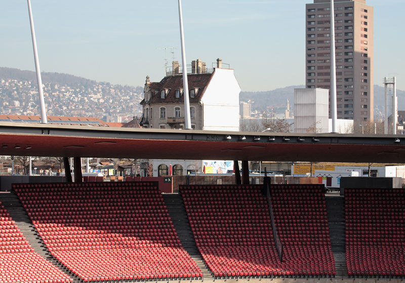
"Diesel Wall Zurich is one of the most prominent walls in the city. From its humble preside on the border of a residential area, this wall rises from the edge of a parking lot, above the busy streets below, to be clearly visible from the 50,000 capacity Zurich Letzigrund football arena. Letzigrund is one of the key stadia to play host to Euro 2008 as well as open air concerts, athletic championships and many other cultural events." (Diesel.com)
The shortlist for the Diesel Wall Zurich has been announced today. Congratulations to the 12 finalists!
My artwork did not make the shortlist. Nonetheless, I would like to take this opportunity and share my submission with you here:
Title:
Everyone has a tree of needs
Description:
The artwork "Everyone has a tree of needs" is primarily a call for celebration.
I. From the distance, there are two adjacent elements that stand out. One is the caption "everyone," and the other is a human silhouette, which depicts a soccer player in the moment immediately following the scoring of a goal. It is a moment characterized by a unique, utterly-human burst of energy/celebration/happiness/ecstasy that occurs in many, if not all, sports. Nonetheless, this particular image captures the moment as it commonly occurs in soccer -- with the player running toward his/her teammates and/or fans while gesturing "Number 1."
The intended message for this "view from the distance" is: "EVERYONE, CELEBRATE! BE HAPPY!" And it is a message aimed at all viewers, regardless of their activity (i.e., attending a concert), as the image focuses on celebration, not on the game of soccer itself (there is no ball depicted).
II. Upon closer look, the artwork reveals the entire caption, "everyone has a tree of needs," as well as the fact that the human silhouette is actually a tree structure of round objects. Together, the caption and the tree structure are a simplified presentation of an innovative theory of human nature that I recently developed as an independent researcher. It is a new theory that states that at any moment, every individual possesses a tree of needs. This structure of needs begins with a dominant need labeled "successful existence," which has a different meaning from one person to another, and from one time to another (typically it is understood as the long-term goal that would translate in happiness). Resulting from the effort to address the dominant need, the rest of the structure is generated through a process of disaggregation (i.e., Need AB = Need A + Need B). In short, this hierarchical structure of needs is the driver of one's existence.
But why would this theory be important to the general population, you might ask? It is important because it lays the foundation for a new economic and business worldview that better reflects reality. (The current mainstream economic view of the world is largely based on concepts developed at least half-century ago.) And that is further important because there is a causal relationship between a society's economic health and democracy. So, ultimately, this theory can help us all better understand what must be done to achieve and/or preserve PERSONAL FREEDOM. (A complete account of this new theory of human nature is available for free at: www.redefiningstrategy.com/HumanNature.pdf)
The intended message for the artwork's detailed view is: "WE ARE ALL UNIQUE, HAVING UNIQUE NEEDS. NONETHELESS, HERE AND NOW, WE ARE ALL EQUAL -- A SHARED MEANING OF 'CELEBRATE! BE HAPPY!' BRINGS US ALL TOGETHER."
Sure, it is rather impossible to predict how people will interpret the artwork. The aim is not to have everyone read the theory of human nature, but rather to have everyone think. The more interpretations, the better. And hopefully, at the end of the day, some will begin asking the right questions; questions that concern our success as a global society.
Also important to mention is the fact that the artwork pays tribute to a local symbol and a National symbol, respectively:
- the blue used for the background is the same blue used in Zürich's coat of arms (see http://en.wikipedia.org/wiki/Image:Ch_zh_wappen_stadt.gif)
- the font used in the artwork is Helvetica, a popular font developed by Swiss typeface designer Max Miedinger (see http://en.wikipedia.org/wiki/Helvetica)
UPDATE 5/22/2008: And the winning artwork is "Bag Bellows Break" by Andreas Marti. Congratulations!


